
Nine different economic chart reports are added to each deployment of Reserves. Each one of these versatile reports can be used to create line charts, bar charts, and area charts.
Picking a Variable Group
As a general rule of thumb, when selecting variables for your chart reports, try and choose variables with the same units. For example, you might choose a group of cash flow and revenue variables for a report — and these will pair nicely as all of the variable values are in dollars.
Chart Report Options
Chart Template
Use the chart template option to select a template for your chart. Chart templates can be configured on the Report Templates page, and are used to control the look and feel of rendered charts (text alignment, color options, ...etc.).
Series Type
Use the Series Type option to control what kind of chart you generate. 3 options are possible:
- Line: Create a line chart.
- Bar: Create a bar chart.
- Area: Similar to a line chart, but the area underneath lines in your chart will not be transparent. Typically, area charts are also run with the stacking option enabled.
Stacking
Enable stacking to sum variable values in your completed chart. In the example chart below, stacking was enabled, along with a pivoted attribute (Field in this example). This allows you to view the total Rate - BOE Net, while simultaneously being able to view the scale of each field's contribution to the total Rate - BOE Net values. Each field's value is stacked on top of the other in each period included in the chart.
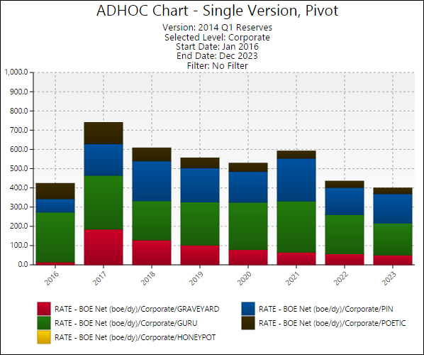
Click image to expand or minimize.
Pivot Attribute
Selecting a pivot attribute will pivot your variable's values against the attribute you select. In the example above, a chart was created using the Rate - BOE Net variable. By selecting Field as a pivoted attribute, the rate values for each field can be seen.
Chart Labeling Options
Four labeling options have been configured for economic charts:
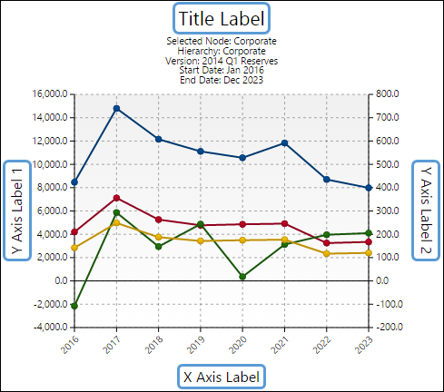
Click image to expand or minimize.
- Title: Use the Title option to set the title of your completed chart.
- X Axis Label: Use the X Axis Label option to add a label to the x-axis of your chart.
- Y1 Axis Label: The Y1 Axis Label option will allow you to add a label to the left side y-axis of your completed chart.
- Y2 Axis Label: The Y2 Axis Label option will add a label to the right side y-axis of your completed chart.
Each Economic chart includes the Title report option. Depending on the chart you are running, your chart may include one or all of the other labeling options.
The Data Viewer and Legend
Each time you create a chart, a legend and a data viewer will be displayed on screen. These can both be hidden by right-clicking anywhere on your chart, and choosing the Toggle Data Viewer or Toggle Chart Legend buttons.
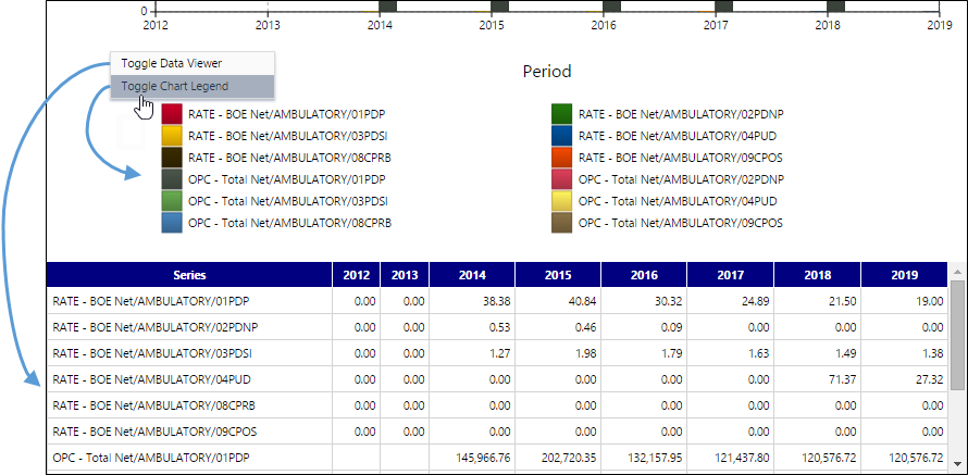
Click image to expand or minimize.
Chart Highlighting
Hover your cursor over a cell in the data viewer or over an item in the chart legend to:
- Hide all other variables (apart from the variable over which you are hovering) from the chart.
- Add an indicator to the chart that corresponds with the cell your cursor is in (emphasized below).
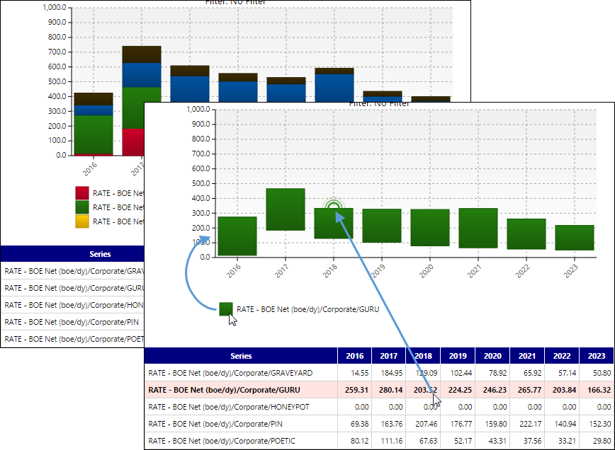
Click image to expand or minimize.
You can also hover your cursor over variables in the chart legend to prevent other variables from being displayed.
Reports
- ADHOC Chart - Multi Version Comparison
- ADHOC Chart - Single Version
- ADHOC Chart - Single Version, Multivariable, Pivot
- ADHOC Chart - Single Version, Multivariable, Pivot with Total
- ADHOC Chart - Single Version, Pivot
- ADHOC Chart - Single Version, Pivot with Total
- ADHOC Chart 2-Pack
- ADHOC Chart 6-Pack
- ADHOC Chart and Report Combo