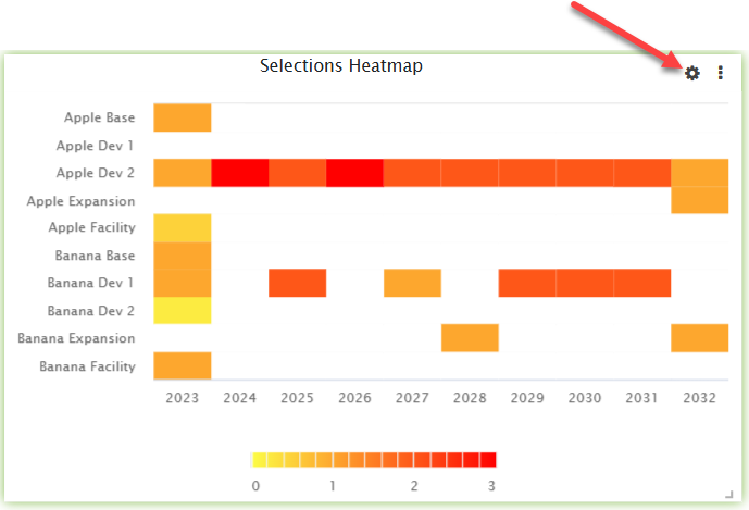
Add the selections heatmap widget to a dashboard to create a visualization of per-opportunity selections in your scenario over time. See Widgets Overview for information about how to add each widget and additional options.
Viewing Selections
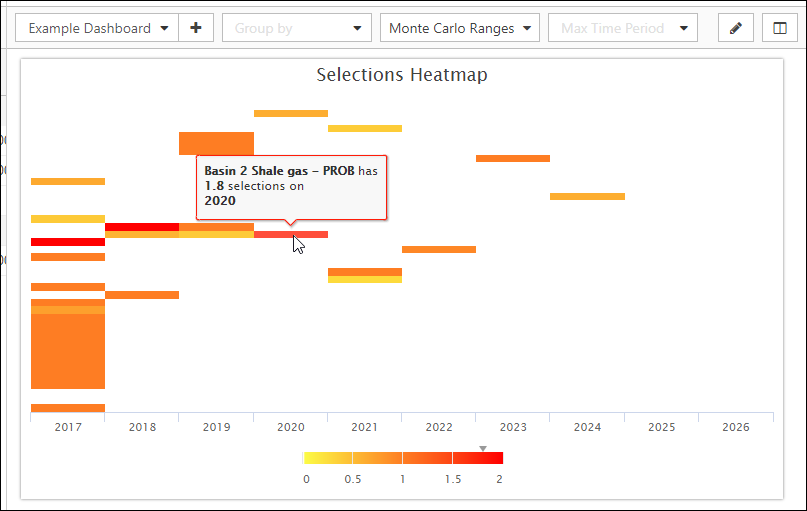
Hover over a segment of the heatmap to display the name of the opportunity it is linked to, and the number of selections associated with it.
Click image to expand or minimize.
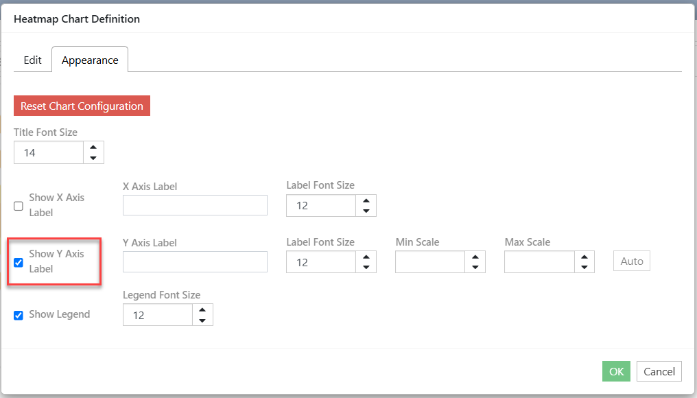
To show Opportunity Names on the Y Axis:
- Hover over the Selections Heatmap to access the widget appearance cog.
- Select/Unselect Show Y Axis Label to view/hide the Opportunity Names on the Y axis.