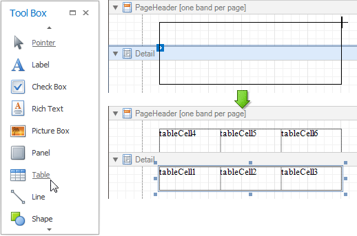

When a table is dropped onto a band from the Toolbox, it has one row and three columns. If you click and drag over several bands, the resulting table will be split by the bands into several tables. This creates a table header and the detail table with one mouse move.

When you drag and drop an entire data table from the Field List, a table with cells bound to the corresponding data fields is created automatically.
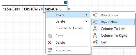
A table's elements are managed by using its context menu.

The whole table, or its individual row or cell can be selected either in the Report Designer, the Report Explorer or the drop-down selector of the Property Grid.
| Property | Description |
|---|---|
| Background Color | Specifies the background color for the control. |
| Borders, Border Color, Border Dash Style, Border Width | Specify border settings for the control. |
| Font | Specifies the font settings for the control. |
| Foreground Color | Specifies the text color for the control. |
| Formatting Rules | Opens the Formatting Rules Editor, allowing you to choose which rules should be
applied to the control during report generation, and define the precedence of the applied rules. To learn more on this, see
|
| Padding | Specifies indent values which are used to render the contents of a table's cells. |
| Style Priority | Allows you to define the priority of various style elements (such as background color,
border color, etc.). For more information on style inheritance, see
|
| Styles | This property allows you to define
odd and even styles for the control, as well as to assign an existing style
to the control (or a newly created one). For more information on style inheritance, see
|
| Text Alignment | Allows you to change the alignment of a table's text. |
| Property | Description |
|---|---|
| Anchor Horizontally | Specifies the horizontal anchoring style of a table, so that after page rendering it stays attached to the left control, right control, or both. |
| Anchor Vertically | Specifies the vertical anchoring style of a table, so that after page rendering it stays attached to the top control, bottom control, or both. |
| Keep Together | Specifies whether the contents of a table can be horizontally split across pages. In other words, if a table occupies more space than remains on the page, this property specifies whether the table should be split between the current page and the next, or whether it will be printed entirely on the next page. This property is in effect only when a table's content does not fit on the current page. If it does not fit on the next page either, then the table will be split despite this property's value. |
| Scripts | This property contains events, which you can handle with the required scripts.
For more information on scripting, see |
| Visible | Specifies whether the control should be visible in Print Preview. |
| Property | Description |
|---|---|
| (Data Bindings) | This property allows you to bind some of a table's properties (Bookmark, NavigateURL, Tag and Text) to a data field obtained from the report's data source, and to apply a format string to it. |
| Tag | This property allows you to add some additional information to the control; for example its id, by which it can then be accessible via scripts. |
| Property | Description |
|---|---|
| (Name) | Determines a control's name, by which it can be accessed in the Report Explorer, Property Grid or via scripts. |
| Property | Description |
|---|---|
| Location | Specifies the control's location, in report measurement units. |
| Size | Specifies the control's size, in report measurement units. |
| Snap Line Margin | Specifies the margin (in report measurement units), which is to be preserved around the control when it is aligned using Snap Lines, or when other controls are aligned next to it. |
| Property | Description |
|---|---|
| Bookmark, Parent Bookmark | These properties are intended for the creation of a hierarchical structure within a report
called a document map. For an explanation and help, see
|